The visual identity of a Melbourne-based digital agency that builds and supports Drupal websites: the mark, the palette, the type, the voice, and every surface they live on.
DrevOps Brand Book · Version 1
DrevOps · Brand Book · Version 1
Contents
01Brand at a glanceThe slogan, the descriptor, the signals
11Imagery & art directionOne photograph, 3 treatments
12Do's and don'tsThe guardrails
13GovernanceWhere the assets live
About this book. The identity documented here is the identity the book is set in: Plus Jakarta Sans and Outfit on Navy, with the DrevOps teal and coral. Every colour, typeface and rule the book states, it also demonstrates on its own pages. Facts authored to complete the system are marked (● inferred).
The one screen
Brand at a glance
We are a Melbourne-based digital agency that builds and supports Drupal websites. We work with organisations that rely on their website every day, across government, education and business. The identity has one job: make a buyer feel that the work will be done properly and still be here in 3 years.
Your website can't afford to wait.
MelbourneBased in Melbourne, delivering across Australia. The location travels with the descriptor.
DrupalEvery site we build and support runs on Drupal, and we name the platform plainly.
TestedAutomated testing and continuous integration on every project from day one.
Since 2016Operating since 2016. Vortex maintained continuously since 2018.
The 2 lines every piece of copy is built from
Slogan, the lead everywhere. Your website can't afford to wait.
Descriptor. We are a Melbourne-based digital agency that builds and supports Drupal websites.
The idea underneath
Brand platform
Engineering discipline, and our own open-source tooling, applied to websites that carry an organisation's daily work.
PositioningFor mid-market organisations whose website is critical infrastructure, the Melbourne-based digital agency that builds and supports Drupal websites. You choose how it is built, hand-crafted or AI-assisted.
ArchetypeThe Craftsman. Takes the work seriously, does it properly, and stands behind it afterwards. ● inferred
RegisterPlain English first. Technical detail when it earns its place. Conversational over corporate.
Central tensionMost builds force a trade-off between speed, quality and cost. Our engineering discipline and our reusable tooling let a client keep all 3, which is why the anchor is done properly and the AI saving sits underneath it.
CategoryDigital agency. Always agency. "Consultancy" is a hard ban, and so is "Drupal platform": we build websites.
The one-line test. Read the line back. If it only lands because the reader already assumes the bad thing is normal, it is off-brand. Name what we actually do and stop there.
The job of the identity
What the brand must signal
A buyer choosing an agency is asking 4 quiet questions. The visual system answers them in the first second, before a word of copy is read.
Will it still work in 3 years?
Look engineered. Restraint, structure, generous space, and a system that is visibly a system.
Will anyone be here after launch?
Look settled and continuous. One accountable team, present from the first commit through every year after.
Do they know Drupal properly?
Show the proof: Vortex, GovCMS, defence, universities. Name the platform plainly on the surface.
What will it cost me?
Look straight. Published rates, plain numbers, scope and cost agreed before work starts.
The audience
Who it is for
4 audiences, in the order the brand serves them. The mid-market spine is where the identity and the pipeline point.
Mid-market organisations
The spine. Their website carries the day-to-day work, across commercial, not-for-profit and education. Complex builds in the $50-100k+ band, won directly.
Government, defence and GovCMS
The credibility. Environments with a rigour bar we already build to, and the proof that carries into every other conversation.
Small organisations
The on-ramp. A professional site quickly, through Website as a Service, which can grow into a full engagement.
Branded agency partners
The channel. We provide the technical build and stay named to the end client, so the brand keeps compounding.
The mark
Logo system
The mark is the Drupal droplet drawn as 3 nested outlines. It names the platform we build on, and it draws the way we work: build it once, then build on it.
3 forms, each drawn twice: once for a light ground and once for a dark one. Top row sits on light, bottom row on dark. Never recolour a lockup to reach a ground it was not drawn for.
Primary · on light
Stacked · on light
Mark · on light
Primary · on dark
Stacked · on dark
Mark · on dark
Clear space & minimum size
Keep clear space on all 4 sides equal to the width of the mark's innermost droplet. Minimum size: 24px / 8mm for the mark, 120px / 32mm for the primary lockup, 64px / 18mm for the stacked. Primary by default; stacked where the space is taller than it is wide; mark alone below the minimum, at favicon and avatar sizes, or where the wordmark already appears nearby. ● inferred - authored to complete the system; confirm against the master logo files.
Misuse
×
Don't stretch
×
Don't rotate
×
Don't recolour
The palette
Colour
A deep navy ground, one teal accent, and a coral held in reserve. The palette stays quiet so the work on the page carries the page.
Navy
Ground · primary
HEX 152235 RGB 21 34 53 CMYK 60 36 0 79
Deep Navy
Ground · deepest
HEX 030D1E RGB 3 13 30 CMYK 90 57 0 88
Cool White
Light surface
HEX EFF6FF RGB 239 246 255 CMYK 6 4 0 0
Teal
Accent on light
HEX 1E7582 RGB 30 117 130 CMYK 77 10 0 49
Bright Cyan
Accent on Navy
HEX 96E7F4 RGB 150 231 244 CMYK 39 5 0 4
Coral
Reserved · the problem
HEX CD5B43 RGB 205 91 67 CMYK 0 56 67 20
Usage ratio
White and Cool White 56%Navy 28%Teal 12%Coral 4%
What it isA 3-colour system on a light-first ground: Navy for structure and chrome, Teal for the signal, Coral for the problem being described.
When to useNavy for headers, footers, covers, dividers and dark panels. Teal for links, kickers, rules, ticks and the single call to action. Coral only where the copy is naming a problem, a warning or a "before" state.
How to useHold roughly the ratio above. Each of the 6 sits on an 11-step ramp from near-white to near-black, so a tint or a shade of any of them is already in the system. Bright Cyan replaces Teal on Navy. ● the ratio is authored guidance.
Don'tLet Coral decorate, promote it to a second accent, run Teal small on Navy, introduce a colour that is not on one of the 3 ramps, or use the status greens and reds for anything but a genuine status.
Accessibility. White on Navy and Navy on Cool White both pass AA at body size. Teal on white passes AA for body text; on Navy use Bright Cyan instead. Coral is for headings, labels and rules, never small body text on white. Run any new pairing through a contrast checker before it ships, and hold AA as the floor.
The type
Typography
Plus Jakarta Sans carries the headlines, Outfit does the reading, and Fira Code handles anything literal. All 3 are open source.
Design, architecture, development, CI/CD, hosting and ongoing support, handled by one accountable team.
Mono
Fira Code
Weights 400, 700 · code, commands, tokens, specs
$ ahoy build
Teal · #1E7582 · RGB 30 117 130
What it isA 3-face system: 1 geometric sans for display, 1 lighter geometric sans for reading, 1 monospace for anything literal.
When to usePlus Jakarta Sans for every heading, figure and label. Outfit for body copy and interface text. Fira Code for commands, file paths, colour specs and anything quoted literally.
How to useSet display at 700 or 800 with tight tracking (-0.02em). Set body at 300 for reading, 500 for emphasis. Numbers are always digits, including 1 through 9.
Don'tAdd a 4th face, set body copy in the display face, set headings in Outfit, letterspace lowercase text, or write a quantity as a word.
The kit
Brand elements
Beyond the logo, 3 devices carry the brand: a thin-line icon set, the Navy field, and the coral signal. Each is shown on its own, with what it is and how to use it.
Icon set
The mark
Tested
Supported
Reusable
What it isA set of thin single-weight line icons for feature rows, service lists and reassurance strips near a call to action. ● indicative direction.
When to useService pages, leaflets, decks and proposals, wherever a short list needs a visual anchor.
How to use1.6px stroke, round caps and joins, on a 24px grid. Draw in Navy on light and white on Navy, one tone per icon.
Don'tFill them, mix stroke weights, tint them coral, or put more than one colour inside a single icon.
The Navy field
The dark panel that opens a document, a deck or a page section.
What it isA Navy to Deep Navy field carrying the reversed lockup, with a soft teal glow set well away from the type.
When to usePDF covers, slide title and divider slides, the LinkedIn banner, website section breaks, and the back cover of this book.
How to useOne shallow-angle sweep from Navy into Deep Navy. Reversed lockup, generous space around it, type in white with the kicker in Bright Cyan.
Don'tRun a multi-hue or pastel gradient, set long body copy over the field, or crowd the lockup with more than 1 message.
The problem
Drupal 7 reached end of life. The site still runs on it.
What we do
Migrate it to Drupal 11, tested, with the content intact.
The coral signal
One colour that always means the same thing: this is the problem.
What it isCoral reserved as the brand's antagonist colour, set against Teal wherever a before and after, a risk and a fix, or a problem and an answer sit together.
When to useComparison columns, warning callouts, risk tables in assessments, the "before" half of a slide, an end-of-life notice.
How to useKeep it to a keyline, a label or a rule. Give the answer alongside it in Teal, so the pair reads in one glance.
Don'tUse coral as a decorative accent, on a call to action, or anywhere the copy is not naming a problem. Its meaning is the whole value.
How it speaks
Voice & tone
One voice, everywhere a client or prospect meets us. We lead with the reader's problem, stay warm, and say the positive thing plainly.
CharacterProblem-first, empathetic, educational. Warm without being fluffy, expert without being preachy. Conversational over corporate.
Where it appliesWebsite, service and landing pages, blog, social, proposals, and every email. There is no second register for public work: if a reader outside the business will see it, it is written this way.
Pronoun"We" for the organisation. "I" for Alex, in emails and LinkedIn posts, where there is a named sender.
Technical depthExplain the thing, then name it. A reader who does not know the term still follows the sentence, and a reader who does is not slowed down.
Say this
Not this
One accountable team, from the first commit through every year after launch.
One accountable team, no vanishing at launch.
One published rate. You approve scope and cost before work starts.
Clear rates, no hidden markup, no surprise invoices.
Your team relies on the website every day.
Your website is critical infrastructure rather than a brochure.
A fixed-price quote is the price. We carry the overspend.
The invoice matches the estimate.
We are a Melbourne-based digital agency that builds and supports Drupal websites.
A Drupal delivery shop. A consultancy. A Drupal platform.
Automated testing and CI on every project from day one.
Em dashes. Use a full stop, a comma, a colon, or rewrite the sentence.
The tension resolver. No "X rather than Y", "X, not Y", "not just X, but Y". Say the positive thing and stop.
Defining ourselves by an absence. No "no surprises", "no lock-in", "zero handovers". Name what we actually do.
Headcount claims. Frame around process, testing and review. Quality descriptors are fine.
Guardrail. Every claim has to be one we can honour literally, so check the promise against how we actually work before it ships. We differentiate by what we affirm: senior engineering, tested, accountable, yours to keep. The contrast is always with the usual speed, quality and cost trade-off, never with another agency.
In the world
Applications
The identity applied across the surfaces DrevOps actually lives on. Each is shown on its own, with what it is and how to use it.
The plates
01Website heroThe front door at drevops.com
02Leaflet coverThe printed and PDF service leaflets
03LinkedIn post imageThe one social surface we post to
05Email signatureThe most-seen brand surface we own
www.drevops.com
Services Work Blog Contact
Melbourne · Drupal since 2016
Your website can't afford to wait.
We are a Melbourne-based digital agency that builds and supports Drupal websites. Engineered properly, tested from day one.
Talk to usSee our work →
Website hero
The first thing a visitor sees at the top of drevops.com.
What it isThe homepage hero: the slogan, the descriptor underneath it, 1 primary action, and a credibility pill.
When to useThe top of the website and every campaign landing page.
How to useLight ground. The slogan in Plus Jakarta Sans 800 at -0.03em with the last word in Teal. The descriptor verbatim underneath. 1 teal call to action, 1 quiet text link beside it.
Don'tReplace the slogan with a campaign line, give a second action equal weight, or let the sub-line compete with the headline.
Your website can't afford to wait.
Melbourne-based. We build and support Drupal websites, and we host and maintain them afterwards.
drevops.com · alex@drevops.com
Leaflet cover
The cover of every printed and PDF service leaflet.
What it isA Navy cover carrying the reversed lockup, the slogan, a teal tick rule, and 1 line of what we do.
When to useThe service, hosting and design leaflets, and any new leaflet added to the set.
How to useSlogan first at the top of the type stack, mark above it, contact strip in Deep Navy along the foot. Name the leaflet by subject and depth, never by paper size.
Don'tFill the cover with services, set the slogan below the fold of the panel, or swap the Navy ground for a photograph.
Drupal 7 end of life
111 releases in a year, and 1 of them broke the site.
drevops.com
LinkedIn post image
The card that runs above a LinkedIn post.
What it isA Navy card holding 1 idea: a cyan kicker naming the topic, 1 statement in the display face, the lockup and the domain along the foot.
When to useEvery LinkedIn post that carries an image, including blog companions and release notes.
How to use1 statement, short enough to read at thumbnail size. Numbers as digits, because a figure is what stops the scroll. Navy ground, cyan kicker, lockup bottom right.
Don'tSet a paragraph on the card, stack 2 messages, add a call to action, or drop the lockup.
Quotation
Website Redesign
Prepared for a client Version 1 · 11 August 2026 Prepared by DrevOps
Client document cover
The first page of every quotation, assessment, report and invoice.
What it isThe shared PDF cover: reversed lockup at the head, document kind as a cyan eyebrow, the subject in the display face, and a meta block naming the client, version, date and preparer.
When to useEvery client-facing PDF DrevOps sends.
How to use1 cover, 1 running header and 1 running footer, shared by every document kind and filled per document. Build the pages from components that already exist, so a document reads as the system.
Don'tWrite bespoke visual styling for a single client document, let a document kind grow its own private cover, or omit the version and date.
Alex Skrypnyk
Director · DrevOps
alex@drevops.com · drevops.com Melbourne, Australia
Email signature
The brand surface a client sees more often than any other.
What it isThe stacked lockup beside a name, role, and 2 lines of contact detail, held together by a teal keyline.
When to useEvery outbound email. The short form, name and role only, on replies inside a running thread.
How to useHold one master version and mirror it into the mail client, so the two never drift. Web-safe fallbacks behind the brand faces, because most mail clients will not load them.
Don'tAdd banners, awards, quotes, social icon rows or a confidentiality notice. The signature carries who is writing and how to reach them.
The look
Imagery & art direction
Every image is a photograph: photorealistic, naturally lit, true-to-life colour, ungraded. That constant is what makes the whole site read as one thing. Within it there are 3 treatments, which differ only in what is in front of the camera.
The treatments
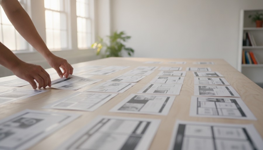
01FacelessReal people at work, never a face
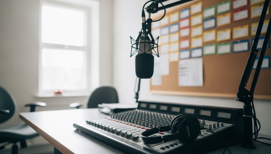
02NaturalA real room, empty of people
03AbstractReal materials, sculpturally arranged
A. Faceless
People present and working, with no face in frame.
What it isHands, backs and torsos cropped at the shoulder, or a figure soft in the distance. Hands alone is the safest framing and the most repeatable.
When to usePages about how we work: services, AI-assisted delivery, and the Work landing page.
How to useCrop so no head is anywhere in shot. Bright, well-lit interiors, open shadows, foreground sharp and the room falling gently out of focus. Compose the subject inside the central square so a card crop keeps it whole.
Don'tShip a frame with a face, a profile, readable text, a screen, or hands with the wrong number of fingers. Check every generated frame for all 4.
B. Natural
A real room from the project's own world, empty of people.
What it is3 or 4 related elements telling the premise in 1 frame, a close element in front and the room behind it.
When to useClient project pages, where the room says what the work is for without showing the client's site.
How to usePhotograph the world the site serves. Where the client's world is physical, photograph it. Where the work is digital and the client is not, photograph the place their users end up: a hearing room, a reading room, a waiting area.
Don'tStand a physical prop in for a digital artefact. A content migration is not a filing cabinet, and permanent identifiers are not a card catalogue.
C. Abstract
A sculptural arrangement of real materials, photographed.
What it isSolid geometric forms in matte concrete, painted timber and plaster, 1 form in warm terracotta, on a plain seamless surface.
When to useSubjects with no physical world at all: our own open-source tooling, a concept, a way of working.
How to useLet the arrangement carry the meaning: a loose stack gathering into 1 sealed block, a tall stack beside a short one. Same camera and light as the other 2 treatments.
Don'tGet clever. If a reader has to decode the arrangement, it has failed.
Generate all 3 and choose. A subject that looks obvious on paper often reads differently once photographed, and the 3 treatments cost 1 run. The 3 photographs above are the approved reference: judge a new frame against them for light, colour and framing before it ships.
The guardrails
Do's and don'ts
Do
Lead with the slogan, then the descriptor. In that order, in every channel.
Say "Melbourne-based digital agency". The location travels with the category.
Reach for a token, so the piece re-skins when the system does.
Keep Teal as the single accent and hold Coral for the problem.
Write numbers as digits, including 1 through 9.
Check every claim against how we actually work before it ships.
Don't
Say "consultancy", "Drupal platform", or "Drupal delivery shop".
Use an em dash, anywhere, in any channel.
Set up a strawman and knock it down: "X rather than Y", "not just X, but Y".
Claim what we do not do. Name what we do.
Put a competitor down, named or implied.
Invent a colour, a face or a component that is not in the system.
Keeping it consistent
Governance
Each fact has exactly 1 home. That is what stops the brand drifting: a document that restates another document is the copy that goes stale.
What this book governs
The mark and its lockups, the 6 colours, the 3 typefaces, the icon set, the Navy field, the coral signal, the voice, and the 5 application surfaces in section 10. Anything the book does not cover is a decision waiting to be made, not a licence to improvise.
Who decides
DrevOps owns the marks and this book. Identity, slogan, descriptor, positioning, audience, messaging and voice are settled here; when a piece of work conflicts with the book, the book wins and the work gets corrected. Services and prices are settled elsewhere and are never restated in brand material.
Getting help
Questions about the brand, a new lockup, or an application not covered here go to alex@drevops.com. This book is versioned; raise the version and the date whenever the identity changes, and reissue it rather than patching a copy.
The one rule
When in doubt, say the plain true thing and stop. It is almost always the on-brand one.
DrevOps Brand Book
Version 1 · 11 August 2026 www.drevops.com · alex@drevops.com Melbourne, Australia